RAY SAYS: This is a preview of a paid subscribers’ entry. If you want the rest, subscriptions are $6/month or $60/year and get you more newsletters, more downloads, access to a private Discord chat, the entire archives, a private Dylan-boots streaming platform, and more.
Or just enjoy the first part for free!
Bob Dylan Concert Posters in the 1980s
How he advertised giant tours with Santana, Tom Petty, and the Grateful Dead—plus the first Never Ending Tour shows
Heads up for Blood on the Tracks fans with deep pockets: There’s an auction going on for never-seen handwritten lyric drafts that ends Thursday. Find the auction at RR Auction and read more about the lyrics at Anne Margaret Daniel’s site. Okay, onto today’s newsletter…
I began this entry thinking that there weren’t as many posters for Bob Dylan in the 1980s as there were in the 1970s and the 1960s. Turns out, that’s only partly true. He did a number of big tours in the 1980s. While some of those tours didn’t have many posters, others had a ton.
As usual, I’ll start with the standard poster formats—the ones that Dylan used for many shows—then share some favorite one-offs at the end. (Credit as always to DylanStubs, where most of these come from.)
Disclaimer: I’m using the term “poster” a little loosely. “Printed concert advertising material” is more accurate, but makes for a cumbersome headline. Working off digital images of these decades later, it can sometimes be difficult to determine whether these were posters hung up on walls, flyers handed out, or even ads in magazines or newspapers. Where I do know, I’ll say.
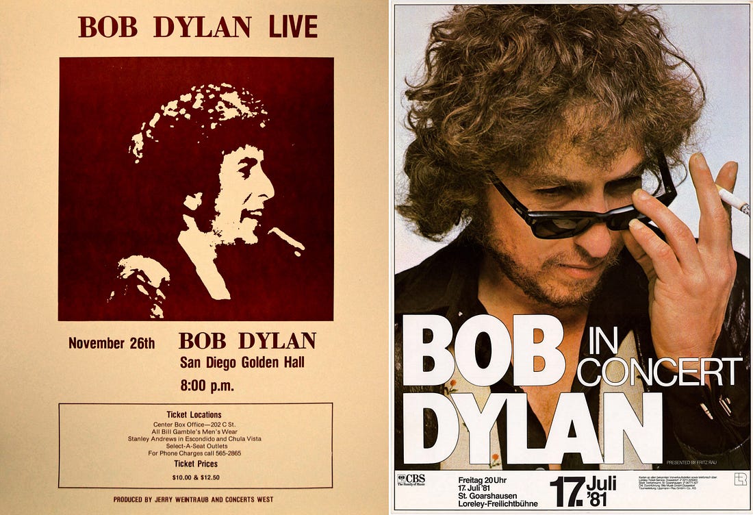
The gospel tours of 1979, 1980, and 1981 seemed to be mostly sold via newspaper advertisement, but I found a couple standardized posters used sporadically. The one on the left was used a few times in November 1980 on the West Coast, then the one on the right was used fairly often in Summer 1981 in Europe. Love that Annie Leibovitz photo, taken in 1977 during his Rolling Stone cover shoot. If it looks familiar, it’s because he also used that photo for a bunch of 1978 posters.
 |
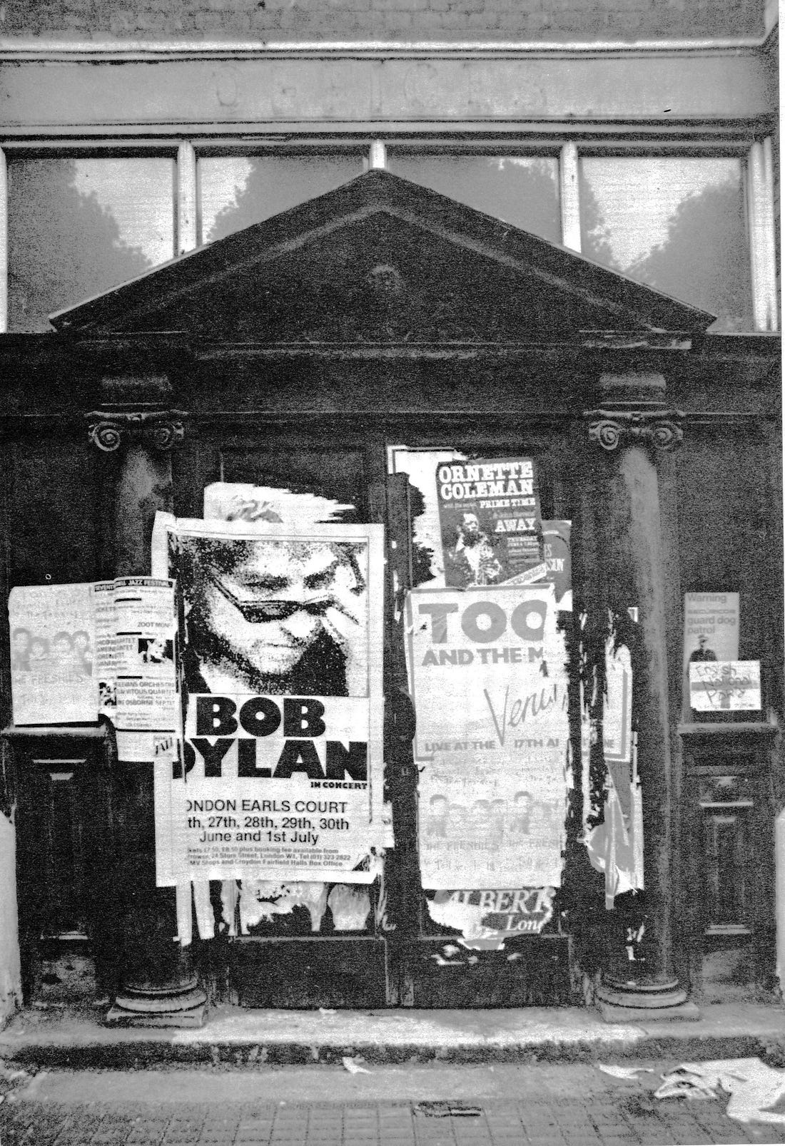
Here’s a photo of that second poster in action that was printed in the Bob Dylan Songbook (thanks Ian Woodward for sharing):
 |
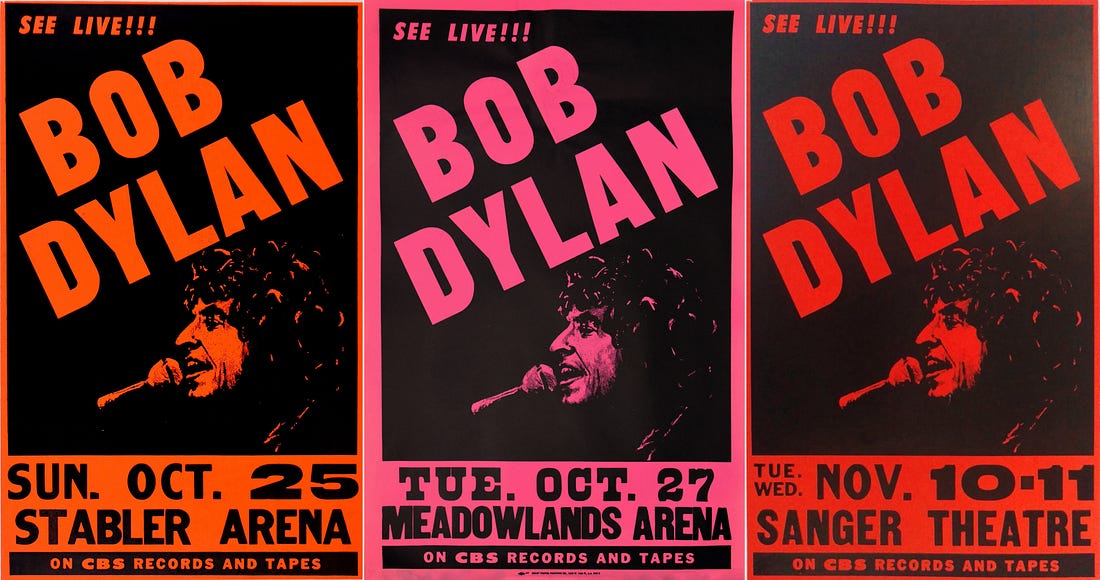
Then, in Fall 1981, they switched to this template. Which I like in terms of design (it has a Never Ending Tour flavor, especially that “SEE LIVE!!!” tagline—like a precursor to “Don’t You Dare Miss It”), but that’s kind of a ghoulish drawing of Bob, no?
 |
His next tour, 1984, proved a rich one for posters. No surprise, maybe: Dylan was playing giant stadiums with Santana, and they had a lot of tickets to sell. Joan Baez was on the first batch of dates too, and they used this design, which looks great.
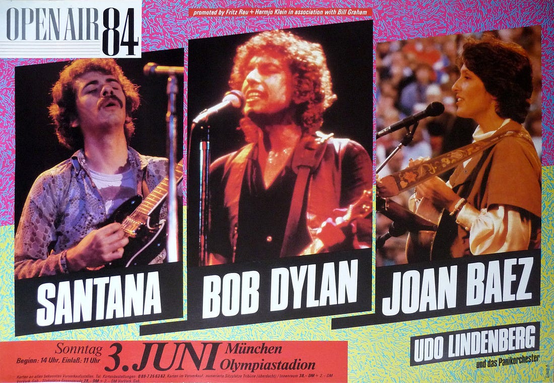 |
Both of the alternate poster designs below got used a few times too. I like them slapping on the tiny “BOB” in the one on the left, in the little box above “DYLAN.” Like it might not otherwise be clear which Dylan they were referring to. Was Dylan McDermott touring with Santana?
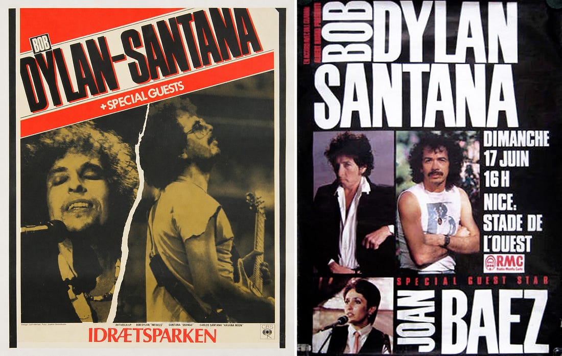 |
When the 1984 tour came to the UK—promoted by superpromoter Harvey Goldsmith, who I interviewed here—they switched to this design. No Baez anymore, but a variety of openers. As you’ll see, those openers are the primary difference between these two examples:
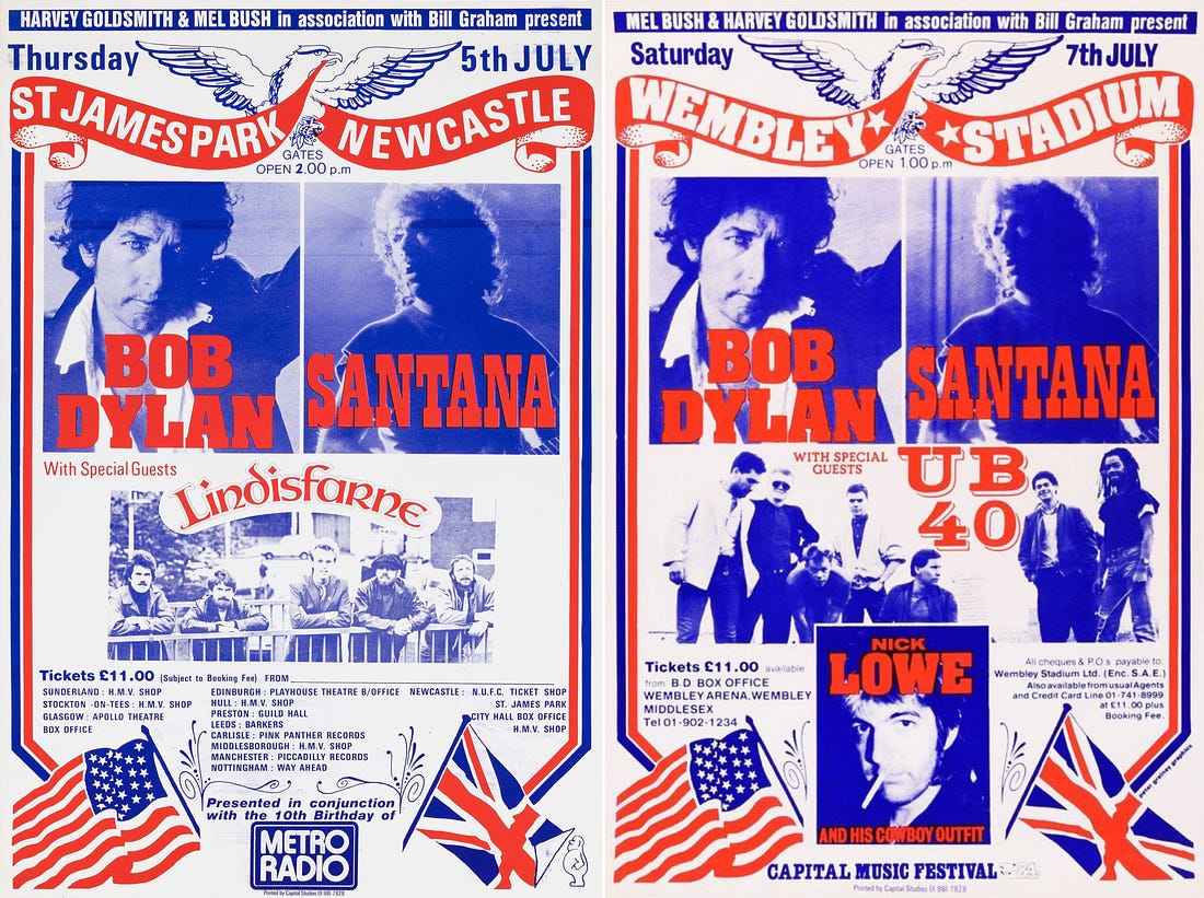 |
Note the red-white-and-blue theme around the Fourth of July, and the American and British flags too.
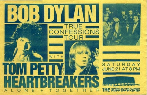
Now for a personal favorite tour, the first Dylan/Petty run—“True Confessions” 1986. I wrote a whole series on it earlier this year. A couple standard poster templates across Australia, Japan, and the U.S.:
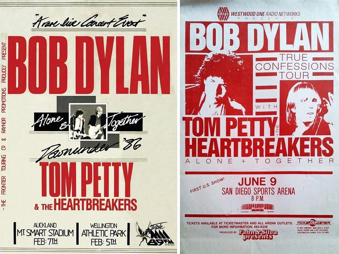 |
There was also this horizontal variant, which included their photoshoot together:
 |
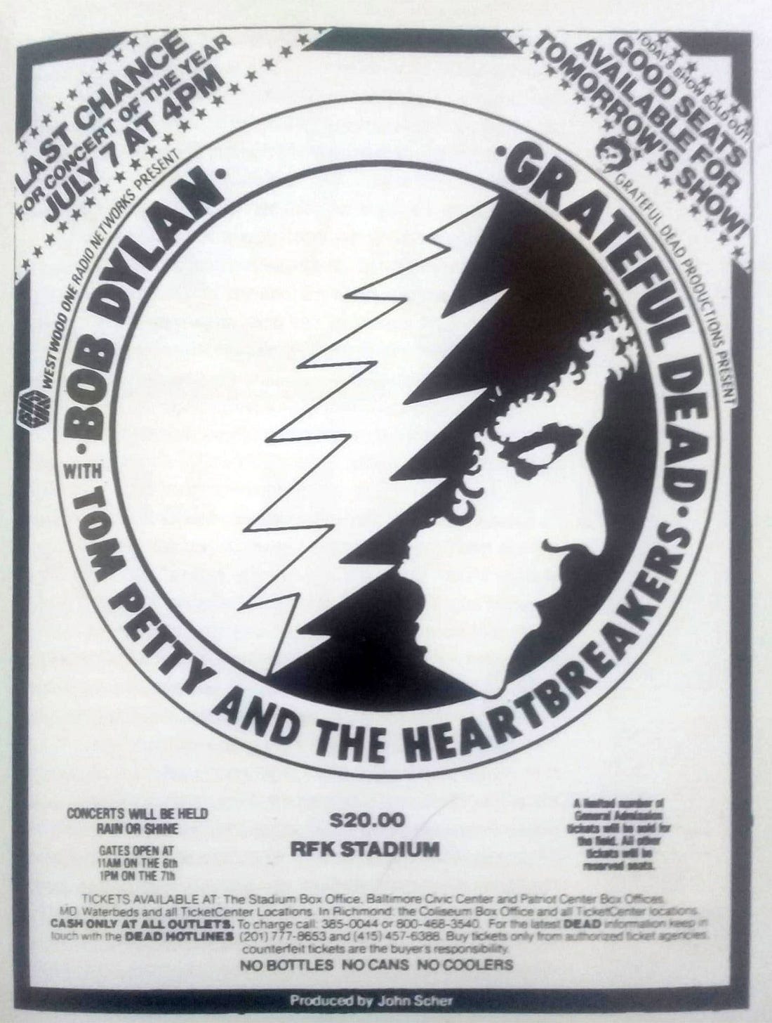
A few of those summer shows featured the Grateful Dead on the bill too (Dead scholar Jesse Jarnow recently wrote about them here). The Dead people came up with this excellent Dylan+Dead graphic for the occasion:
 |
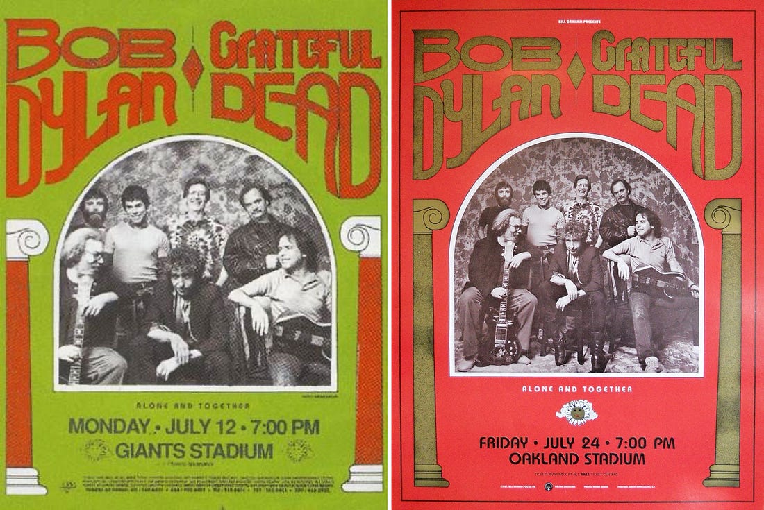
Strangely, the next summer, when Dylan was (in)famously using The Dead as his backing band, they didn’t bring back that logo. Then again, they did have a great new photo to use. Posters looked like this. You’ll notice they repurpose the phrase “Alone + Together” from the Petty tours.
 |
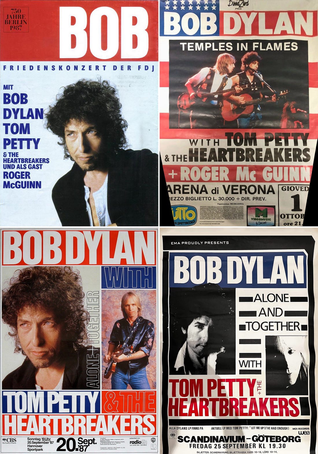
In the fall, Dylan was back with Tom Petty and The Heartbreakers for one more round. The tour name changed for this final run from “True Confessions” to “Temple in Flames.” The poster designs mostly changed too, though a few places used variations on the 1986 version. Here are some designs that popped up a lot in Europe:
 |
Which brings us to…drumroll…the Never Ending Tour!
The 1980s only have two Never Ending Tour years, but three primary poster designs. The first two, which seemed to get used interchangeably for 1988 and the first part of 1989, were these. There are many design variations on them for different shows, but these are the two photos that come up over and over again:
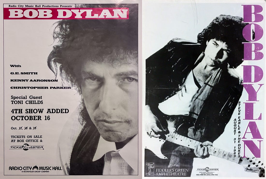 |
I do love on these early Never Ending Tour posters that they list the band members. G.E. Smith might well be known to Saturday Night Live viewers. You can find early newspaper ads that list Marshall Crenshaw too, who was hired and fired as Bob’s bassist before playing a single show.
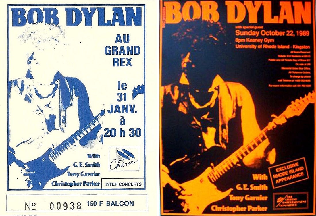
Then, in fall 1989, all of a sudden the posters and promo materials switched to this blown-out live photo where you can’t really see his face.
 |
No comments:
Post a Comment